


12th July, 2013 by Mota Italic
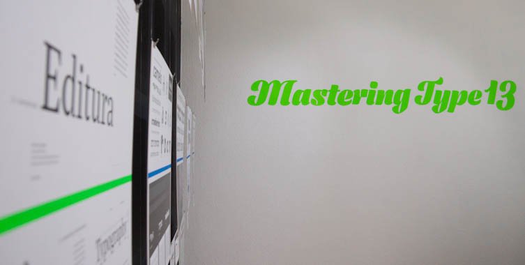
Mastering Type 13
For the third time, we present the typefaces of the 2013 masters students of the Koninklijke Academie van Beeldende Kunsten (NL) and the University of Reading (UK). This joint preview of Europe’s two greatest MA programs provides a first view of their fresh new designs.
July 12th – August 3rd, 2013
Featuring:

Aakriti –
Aakriti (ಆಕೃತಿ) harmonises Kannada, a south-Indian script used by 38 million people, with Latin script.
Katy Mawhood
is an experienced and professional typographer from the United Kingdom. She has worked on a range of projects and specialises in complex typography. She entered the course in typeface design at the University of Reading in the hope of expanding her knowledge of non-latin scripts. Once she graduates from the MA Typeface Design, she hopes to continue her career as a typographer with a fresh perspective and a new specialism.

Amanita –
Amanita is a family of three styles: regular and black stencils, and a matching text version.
Krista Radoeva
is a designer with a focus on typography and type design. Born in Bulgaria, she grew up with a love for history and language and continued exploring these subjects in her work as a graphic design student at Central Saint Martins College of Art and Design in London. Her studies and her work experience in publication design both in the UK and Bulgaria influenced her to pursue further education in type design on the Type and Media course in The Hague. Underlining themes in her work relationships between language, history, typography and experimentation. During her time in The Hague, alongside working on her final project, she had the opportunity to pursue her interest in Cyrillic type design and the contrast between Russian and Bulgarian Cyrillic.

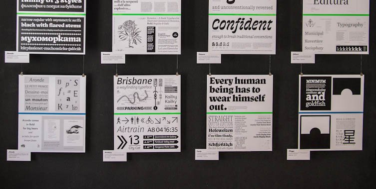
Aronde –
provides a variety of weights (regular, bold and italic) to enable more design possibilities for children’s books, magazines, catalogues or packaging.
Stéphane Passerat
is a French designer born in 1986. He did his master in graphic design at the visual communication school of Paris in 2010 followed by a master in typeface design at the university of Reading this year.

Binky –
is a type family inspired by wood type. The display styles explore extreme proportions while the text styles work in smaller sizes.
Teo Tuominen
is a Finnish graphic and type designer. Before attending Type and Media he graduated from the Pekka Halonen academy in 2009 and the Lahti Institute of Design in 2012. He has been working as a graphic designer since 2008 focusing mainly on visual identities and typography. In the future he hopes to be able to combine graphic and type design in his work.

Botanica –
is a high contrast humanist typeface. Aside from its use as a text-face, it is devised to be found in the context of technical drawings relating to botanics.
Tania Alvarez Zaldivar
(Mexico City, 1985), graduated from Concordia University, Montreal (BFA, Major in Design, 2009), EINA, Barcelona (Postgraduate course in Typography, 2010) and The Royal Academy of Arts, Den Haag (Type & Media, 2013). Throughout her career she has collaborated as Research Assistant in Montreal for full-time faculty in experimental design based projects, and as an independent / in-house designer for studios in Barcelona and Mexico City. She currently develops her independent design practice based in Mexico City.

Brisbane –
is a relaxed, self-assured sans serif designed specifically for pedestrian wayfinding in the city of Brisbane, Australia.
Troy Leinster
Troy Leinster is a self-employed graphic designer originally from the city of Brisbane, Australia. Before studying TypeMedia at KABK, Troy attended the type design unit at Monash University in Melbourne, followed by the condensed type design program at Cooper Union in New York.

Caligula –
is a typeface family intended for both magazines in print as well as on screen. Styles for highly legibile bodytext are accompanied by various and distictive display styles for expressive headlines.
Jonas Niedermann
grew up in Switzerland and graduated at the Zurich School of Art (ZhdK) in Visual Communication in 2007 and with a CAS in Type Design in 2009. Before attending the MATD program in Reading, he worked as a typographer at TGG Hafen Senn Stieger.

Chimera –
is confident enough to break traditional conventions. It’s distinctive character makes it perfect for bringing an impressive look.
Maria Doreuli
earned a Master at the Moscow State University of Printing. During that time she attended Type Design Workshop and worked on William typeface, under the head of Alexander Tarbeev, whose influence encouraged her to pursue her love for letters. As a result William received Letter.2, Granshan and NewCyrillic awards. She was also selected for ‘Young designer of the year’ by Akzia newspaper in 2011.
Alongside the studies, Maria has been doing commercial type-related projects as a freelancer since 2009. She also had a 3-year experience as a full-time graphic designer.
Since graduating, she always wanted to have the opportunity to continue her studies in type design, at a school that focuses not only on producing typefaces, but on the process of calligraphy, sketching and searching for new directions in design. This is why, last year she moved to the Hague.

Curtis –
is a typeface with a strong calligraphic background. It explores a free approach to contrast and plays with rotation of the tool.
Bernd Volmer
is a graphic and type designer from Germany. Before attending type and media, he graduated with a BA in 2011 from the ArtEZ in Arnhem. During this time he also did an internship at Atelier Carvalho Bernau and developed his knowledge and interest in type design and typography. After graduation he started as a freelancer and worked for Catalogtree. Unconventional and unexpected aesthetics play an important role in his design work, as well as working with and around limitations in the design process.

Damien –
is a project is about the design of a serif typeface with different styles for headline and text sizes.
Lukas Schneider, graphic and type designer, studied visual communication at the Hochschule für Gestaltung in Offenbach am Main. He recently graduated from the master course in type design from the Type and Media program at the The Royal Academy of Art in The Hague.

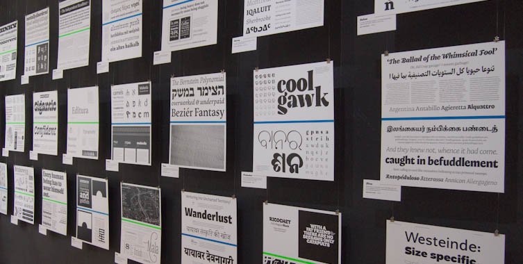
Editura –
is a type family for serious publications, ready to help the designer build structured typographic hierarchies.
Diana L. Ovezea
Born close to the Black Sea coast in Romania, Diana moved to Austria as a child, where she attended the American International School. After graduating with honors from the New Design University in St. Pölten, she worked as a graphic designer, mainly on book and corporate design projects. Her interest in type design has its roots in the fascination with complex systems of design, letter shapes, and micro-typography.

Kingyo –
is a typeface that was made for bilingually typesetting Latin and Japanese.
Reiko Hirai
is a graphic and a typeface designer whom grew up in Japan and America. She has BA in educational linguistics, and also has experience working as a consultant and a research marketer. Therefore, her design works are influenced by her academic and professional background. Compared to her design style, her artistic sense can be seen in her photographs, as she interprets photography as a poetic gesture. She also has experience winning a prize in graphic design competitions. Reiko Hirai currently lives in Reading, UK, to accomplish her master in University of Reading.

Klabauter –
The Klabauter typeface family combines reliable text weights with fresh shapes and playful secondary styles. It supports Latin and Greek.
Louisa-Helen Fröhlich
is a graphic and type designer based in Mainz, Germany. She studied communication design in Mainz and has worked with various design studios since her graduation. She is interested in multi-script typography and corporate design and is currently attending the MA in Typeface Design at the University of Reading.

Makeda –
brings closer 3 different worlds. Hebrew, Amharic (Ethiopic) and Latin are harmonised, while being loyal to the structure of each script.
Liron Lavi Turkenich
is a designer from Israel. She finished her B.Des in Graphic Design, studied and worked for the type designer Oded Ezer. Soon after, Liron started Typeface Design course at Reading University (MATD). Liron has a passion for dusty archives, colours and working with multiple writing systems. (also for food, fashion and traveling, but that’s another story!)

Mala –
is a type family designed for cartography. It provides selected widths and weights which perform efficiently on the map’s surfaces.
Barbara Bigosińska
graduated from Type and Media in 2013 at the Royal Academy of Fine Arts in the Hague. Before that, she received her master degree in Graphic Design at the Academy of Fine Arts in Katowice. In 2010/2011 she was a student-assistant in the Lettering and Typography studio. She is a double scholarship holder from the Ministry of Culture and National Heritage in Poland (2011, 2013). Currently, Barbara is an active designer, not limiting herself to one thing. Her works are featured and exhibited on international and domestic events.

Mellow –
is a cheerful serif type family supporting Latin and Gujarati. Mellow feels most comfortable in a cultural environment.
Lisa Timpe
is a self-employed graphic designer who is currently based in Reading, UK. She used to work mainly in the field of corporate design, focused on any kind of printed matters, after having graduated from University of Applied Sciences Mainz in 2009. After three years as freelance designer as well as employee, she decided to develop her knowledge in type design. Therefore she moved from Mainz to Reading to attend the MATD course at the University of Reading. This very special year supported her desire to get specialised in type design and typography.

Natan –
is a punch cutting fantasy turned into Bézier curves. A tribute to craftsmanship sans nostalgia.
William Montrose
is a German / US type designer currently based in Reading. His background ranges from type design, lettering and calligraphy to marketing and advertising. Apart from the Ampersand Type Design Exhibition and a number of unauthorised paintings the fruits of his labours haven’t been publicly displayed so far. If you have something going on, feel free to drop him a line at william@bezierfantasy.com, he might be interested.

Nomad –
While Nomad’s natural habitat is at the crossroads of referential and literary work, by nature it enjoys discovering the unknown.
Florian Runge
is a typographer and typeface designer from Germany. He spent five years studying and working as a graphic designer in Denmark and subsequently moved to London where he gained a BA in Graphic Design while freelancing alongside. Typeface design lets him combine his genuine curiosity with his methodological design approach and his technical mind. He is fascinated by the writing systems of the world and enjoys growing interest in practice-based research. Currently he is nurturing his desire to learn by attending the MA in Typeface Design at the University of Reading.

Nurraq –
is a multi-script typeface family matching latin and Canadian Aboriginal Syllabics.
Étienne Aubert Bonn
studied graphic design at UQAM in Montréal, type design at Type@Cooper, in New York, and just completed the Type and Media MA in The Hague.

Prakashan –
is a type family that addresses multi-script settings for Odia and Latin, bringing variety and dynamism in style to both scripts.
Alessia Mazzarella
is a student of typeface design. Before joining the MATD at the University of Reading, she studied graphic design at Central Saint Martins in London and at La Sapienza in Rome. She lives and works in Reading.

Ricochet –
is inspired by the speedball D-series, the ball shaped nib developed by the American sign painter Ross Frederic George.
Sun Helen Isdahl Kalvenes
is a Norwegian designer, educated with a BA in Visual communication from the Royal Danish Academy of FIne Arts school of Design in Copenhagen. Internships and studies have brought her living between Stavanger, Copenhagen, Berlin and The Hague.

Salom –
is a type family for complex, yet lively typography, supporting Arabic, Hebrew and Latin.
Igor Labudovic
is a graphic and type designer from Vienna, Austria. After six years of studying design and one year civilian service he managed to get into type design program at the University of Reading, UK. Now he is very busy.

Téras –
the monster, is versatile, fierce and eight feet tall. Every syllable it utters is a mongrel mouthful of various cultural influences.
Sebastian Losch
Prior to pursuing an MA in Reading, he worked as a graphic designer in various places in Germany, stronlgy focusing on editorial design and typography. In the future he hopes to be able to also weave typeface design into the carpet of his professional life.

Westeinde –
is a sans serif type family, with Caption, Text, and Display optical sizes in several weights from Hairline to Black, influenced by the Bauhaus and the Constructivism, and designed in concrete spirit.
Adam Katyi
is a hungarian graphic designer and typographer. Originally from Sopron. He graduated as a graphic designer with a BA from the University of West Hungary at Institute of Applied Arts, Sopron in 2010, and with MA from Moholy-Nagy Art and Design University, Budapest in 2012. Currently he works as a freelance designer, specializing in type and graphic design.

The typefaces used for the exhibition’s were kindly donated by two Berlin-based KABK and Reading graduates.
The titling face is Ludwigsburg by Fritz Grögel (KABK 2010) who co-founded LetterinBerlin with Elena Albertoni in 2011.
The text face is Malabar by Dan Reynolds (Reading 2008) who is currently a research assistant and doctoral candidate at the Braunschweig University of Art.
- Exhibition
- Mota Italic Gallery
See more posts filed under: