


10th August, 2012 by Mota Italic
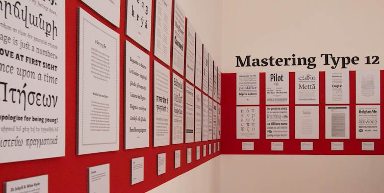
For the second year, we present the typefaces of the 2012 masters students of the Koninklijke Academie van Beeldende Kunsten (NL) and the University of Reading. This joint sneak peek from Europe’s two rival schools provides an early view of their unique new designs.
August 10th – September 15th, 2012
Opening party: Friday August 10th
Allonghata – It is not the construction which matters but the contrast: a typefamily consisting of a flourishing text as well as a lively script version.
Christine Gertsch grew up in Switzerland where her interest in graphic design started. She studied communication design in Basel, Québec, Berlin, and Kolding. Travelling the world with open eyes and ears, she is aiming to connect type design with her interest in languages.

Angata is an attempt to square the circle, or rather to semi-serif the sans. Ultra-legible, it combines a contemporary look with comfortable reading features.
Sociologist turned type designer, Julie Janet Chauffier lives and works in London. She cultivates a holistic vision of the typographic world. Her type design draws inspiration from her multi-disciplinary curiosity.

Blanco – A face for extended reading, it works by itself and as a companion to Mote, by Hrvoje Živčić. They share grey value, family, size and fit.
At 19, Dave Foster graduated with a Bachelor in Visual Communication from Swinburne University. For 5 years he worked as a freelancer with many studios in Sydney and recently began teaching typography part-time. In 2011, he won the Design NSW Travelling Scholarship which allowed him to turn his passion for letters, normally restricted to lunch breaks and evenings, into something more productive by attending Type and Media.

Brasilica is a text typeface developed for bilingual publications in Portuguese and Brazilian indigenous languages.
Rafael Dietzsch is a type designer and typographer based in Brasília, Brazil. Before attending the MATD program, he studied graphic design at the University of Brasília, where he also worked as a lecturer and researcher. In the last 10 years, he has been designing identities, publications and album covers. Since 2010 his is a partner of Vila Cultural, a design and architecture studio based in his hometown.
Cawnpore is a Devanagari-Latin typeface family for small sizes and complex hierarchies, with an experimental Devanagari Cursive style.
Pooja Saxena is a typeface and graphic designer from India, with a passion for language and history. She is currently an intern at Apple Inc.
Dato is a type family with two Italics for Serif & Sans. It is designed to work best in corporate design, brand communication and editorial.
Before attending Type & Media, Daniel Perraudin studied Information Design in Stuttgart and Graz. In 2007 he graduated and worked at KMS Team in the areas of Corporate Design and Typography. His first typeface, Parka, was released by The Font Bureau in 2010. Currently he works as a freelance designer, specializing in type- and graphic design as well as signage & orientation systems (with Gourdin & Müller).
Dr Jekyll & Miss Hyde is a multi-script typeface for magazines and children’s books. It was designed to work as text as well as display face when used as heading.
Elena Papassissa is an Italian designer with a love for type and typography. She obtained a Master’s degree in Communication and Design for Publishing and a Bachelor in Graphic Design and Visual Communication at ISIA Urbino, Italy. In Urbino she attended workshops with Paula Scher, Karel Martens, Maureen Mooren, Armand Mevis, and Peter Bilak. She is currently attending the MA in Typeface Design at Reading University.

Emelia is a friendly typeface family for hierarchical typesetting, supporting the Latin and Tibetan scripts.
Sandra Adler is a graphic designer based near Frankfurt, Germany. After graduating in communication design in 2007, she gained experience in design studios around Frankfurt. Since then, she worked for several museums and specialized in typography. A workshop with Veronika Burian raised her interest in typeface design and encouraged her to attend the MATD programme at the University of Reading.

Leda – Text family consisting of a broken, a serif and an italic style, based on my calligraphic lettering; they share proportions, color and fit.
Aliz Krisztina Borsa is a packaging designer from Hungary. She graduated with an MA from the University of West Hungary, Institute of Applied Arts (AMI), Sopron, in 2010. She also studied painting in Helnæs (DK) and typography at MOME, Budapest (HU). Before studying at KABK, Aliz worked as junior designer on Subjective Atlas of Hungary with Annelys de Vet at new media lab Kitchen Budapest.

Lehiya is a Devanagari text typeface which is designed for extended reading in Hindi and Marathi. With a compact, squarish look, it is inspired primarily by the calligraphic style of old Jain manuscripts.
Pradnya Naik is a designer from Mumbai, India. After graduating from Sir J. J. Institute of Applied Art, Mumbai in 2009 she started working with WhiteCrow Designs. While developing fonts for two Indian languages like Urdu and Gujarati she discovered her interest in type design. Her work is mostly influenced by various Indic scripts. She has been involved with Aksharaya as a contributor and archivist, as well as with the research and development of multiscript typography for various Indic scripts.

Lumen is the world’s first typeface for Burmese, Thai and Latin. It is designed for lexicography, editorial and literary uses.
Ben Mitchell is a Brighton-based graphic designer specialising in type design and typography. He has worked in teaching, marketing, publishing and design. In his spare time, he has designed ten typefaces, some of which are to be published in the coming months. Lumen has definitely been his most ambitious project.

Martha is a soft and clear typeface family designed for complex hierarchies in science magazines and books in Latin, Greek & Cyrillic.
Lisa Schultz is a graphic designer and typographer based in Vienna, Austria. She studied graphic design and advertising at the University of Applied Arts Vienna and worked in a small graphic design studio alongside. In 2011 she graduated with distinction and came to Reading straight away to study Typeface Design.

Mila is a typeface for children’s books. Its shapes and forms are inspired by combining handwriting styles with calligraphic traditions.
Kalapi Gajjar is a Typeface designer specialising in the history and practice of Indian letterforms. He has a keen interest in the varied production techniques surrounding Indian scripts. In the other half of his regular day (if he has any time left at all), he is a postal-artist, an amateur cook (also specialising in Indian food, surprise!), and an obscure-object collector.

Minima – A typeface which reinterprets the classical family structure. It finds new shapes by exploring a hybrid construction between sans and serif.
Originally from Barcelona, Noe Blanco is a graphic designer and type designer currently living in Amsterdam. She holds a BA in Graphic Design from BAU, School of Design and a MA in Advanced Typography at Eina, Escola de Disseny i Art, where her interest in type design began and where she created her first typeface. Since 2008, she has been working as a graphic designer for different studios in Barcelona.

Mote is a utilitarian sans-serif typeface mainly for reading sizes in print, influenced by neutral gothic and grotesk designs. It’s a companion to Blanco, a serifed typeface by Dave Foster.
Hrvoje Živčić is a graphic designer from Zagreb, Croatia where he graduated with an MA from the School of Design. Before Type and Media he worked together with Dario Dević as a freelance duo mainly in print design for various cultural clients from Croatia.

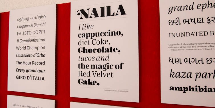
Naila & Rocco are a sassy, tasty, dynamic and versatile type-duo (sans and serif) for big and small sizes primarily for use in editorial and corporate design.
Miguel Reyes is a graphic designer and type designer from Puebla, Mexico. He graduated with a BA as a graphic designer from Benemérita Universidad Autónoma de Puebla and he holds a MA in Type Design from CEGestalt, School of Design. Before Type and Media some of his typefaces where selected in the Biennial of Tipos Latinos in Latin America. He has worked in different studios in México and in Typerepublic (Barcelona).

Nari – A serif typeface family in Latin and Gujarati is designed for multi-script textsetting within exhibition literature and publications.
Dot Georgoulas is a multi-disciplinary designer from Melbourne, Australia. She has a wealth of experience in communication design, art-direction, exhibition design, environmental graphic design and teaching. After the MATD, Dot will specialize in typeface design and typography. Through teaching, she aims to inspire others with her enthusiasm for design.

Overlook – A type system intended for cinema magazines consisting of a neo-grotesque sans serif, and a text typeface developed in four grades.
Michele Patané is an Italian type and graphic designer graduated at Politecnico di Milano. Since 2005 he collaborates with other studios and type designers developing and designing custom typefaces; since 2008 has been involved in teaching at Politecnico di Milano, IED Milano and Accademia di Belle Arti in Brescia. He’s living in the UK since August 2011 where he came to attend the MA in Typeface design at the University or Reading.

Pilot – Condensed typeface with a distinctive character and a slightly nostalgic flavor. Six styles provide a rich variety for any kind of display use.
Aleksandra Samulenkova studied art and design at the Latvian Art Academy, where she graduated with a BA, and at the Kunsthochschule Weissensee in Berlin. She is a multidisciplinary designer and artist. After the Type and Media program she will return to Berlin to continue her work at LucasFonts.
Serendip – Designed to compose the canonical texts of Theravāda Buddhism, supporting Pāli language, transliterated in Latin and Sinhala scripts.
Before attending the MATD in Reading, Rafael Saraiva worked as editorial designer and illustrator in Brazil. In his spare time enjoys nurturing his passion for letterforms by practising calligraphy and lettering.

Sila, meaning link in arabic is an optimized font for the web. It comes in both Arabic and Latin scripts and in 5 weights: thin, light, regular, bold & heavy.
Azza Alameddine graduated with a BA in visual communication from Paris in 2007 and after having worked 2 years in design agencies, she decided to work as a freelancer to art direct her own projects. Her area of expertise is branding where she loves to design logos using custom lettering.

Sultan is firmly placed between readability and character. It’s great for display use, yet readable enough for a wide array of designs.
Sveinbjörn Pálsson studied graphic design at the Iceland Academy of The Arts in Reykjavík. He has had a varied career in design, with work in magazine design, interaction design, art direction, tomb-stone lettering, custom type design and other fields. After graduation he plans to make some typefaces.
- Exhibition
- Mota Italic Gallery
See more posts filed under: